• Страница 2 из 2
  • «
  • 1
  • 2
Кнопки для сайта с hover эффектом на CSS3

Дата: Вт, 06.07.2021, 18:00 | Сообщение 16
Регистр
04.01.2021
Сообщений
455

Репутация
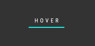
Простые CSS-эффекты наведения кнопок


HTML

Код
<!-- Hover #1 -->
<div class="box-1">
  <div class="btn btn-one">
    <span>HOVER ME</span>
  </div>
</div>

<!-- Hover #2 -->
<div class="box-2">
  <div class="btn btn-two">
    <span>HOVER ME</span>
  </div>
</div>

<!-- Hover #3 -->
<div class="box-3">
  <div class="btn btn-three">
    <span>HOVER ME</span>
  </div>
</div>


CSS

Код
@import 'https://fonts.googleapis.com/css?family=Open+Sans+Condensed:300';

html,
body {
  width: 100%;
  height: 100%;
  overflow: hidden;
  margin: 0;
  display: flex;
  flex-direction: column;
  flex-wrap: wrap;
  font-family: 'Open Sans Condensed', sans-serif;
}

div[class*=box] {
    height: 33.33%;
    width: 100%;
  display: flex;
  justify-content: center;
  align-items: center;
}

.box-1 { background-color: #FF6766; }
.box-2 { background-color: #3C3C3C; }
.box-3 { background-color: #66A182; }

.btn {
    line-height: 50px;
    height: 50px;
    text-align: center;
    width: 250px;
    cursor: pointer;
}

/*
========================
      BUTTON ONE
========================
*/
.btn-one {
    color: #FFF;
    transition: all 0.3s;
    position: relative;
}
.btn-one span {
    transition: all 0.3s;
}
.btn-one::before {
    content: '';
    position: absolute;
    bottom: 0;
    left: 0;
    width: 100%;
    height: 100%;
    z-index: 1;
    opacity: 0;
    transition: all 0.3s;
    border-top-width: 1px;
    border-bottom-width: 1px;
    border-top-style: solid;
    border-bottom-style: solid;
    border-top-color: rgba(255,255,255,0.5);
    border-bottom-color: rgba(255,255,255,0.5);
    transform: scale(0.1, 1);
}
.btn-one:hover span {
    letter-spacing: 2px;
}
.btn-one:hover::before {
    opacity: 1;    
    transform: scale(1, 1);    
}
.btn-one::after {
    content: '';
    position: absolute;
    bottom: 0;
    left: 0;
    width: 100%;
    height: 100%;
    z-index: 1;
    transition: all 0.3s;
    background-color: rgba(255,255,255,0.1);
}
.btn-one:hover::after {
    opacity: 0;    
    transform: scale(0.1, 1);
}

/*
========================
      BUTTON TWO
========================
*/
.btn-two {
    color: #FFF;
    transition: all 0.5s;
    position: relative;    
}
.btn-two span {
    z-index: 2;    
    display: block;
    position: absolute;
    width: 100%;
    height: 100%;    
}
.btn-two::before {
    content: '';
    position: absolute;
    top: 0;
    left: 0;
    width: 100%;
    height: 100%;
    z-index: 1;
    transition: all 0.5s;
    border: 1px solid rgba(255,255,255,0.2);
    background-color: rgba(255,255,255,0.1);
}
.btn-two::after {
    content: '';
    position: absolute;
    top: 0;
    left: 0;
    width: 100%;
    height: 100%;
    z-index: 1;
    transition: all 0.5s;
    border: 1px solid rgba(255,255,255,0.2);
    background-color: rgba(255,255,255,0.1);
}
.btn-two:hover::before {
  transform: rotate(-45deg);
  background-color: rgba(255,255,255,0);
}
.btn-two:hover::after {
  transform: rotate(45deg);
  background-color: rgba(255,255,255,0);
}

/*
========================
      BUTTON THREE
========================
*/
.btn-three {
    color: #FFF;
    transition: all 0.5s;
    position: relative;
}
.btn-three::before {
    content: '';
    position: absolute;
    top: 0;
    left: 0;
    width: 100%;
    height: 100%;
    z-index: 1;
    background-color: rgba(255,255,255,0.1);
    transition: all 0.3s;
}
.btn-three:hover::before {
    opacity: 0 ;
    transform: scale(0.5,0.5);
}
.btn-three::after {
    content: '';
    position: absolute;
    top: 0;
    left: 0;
    width: 100%;
    height: 100%;
    z-index: 1;
    opacity: 0;
    transition: all 0.3s;
    border: 1px solid rgba(255,255,255,0.5);
    transform: scale(1.2,1.2);
}
.btn-three:hover::after {
    opacity: 1;
    transform: scale(1,1);
}


Скачать с Облака | 4,47 КБ

Подписывайтесь! Рекомендуйте нашу группу своим знакомым профессионалам в IT WiN-Prog Наша группа ВКонтакте!


Дата: Вт, 06.07.2021, 18:05 | Сообщение 17
Регистр
04.01.2021
Сообщений
455

Репутация
Интересное решение анимации для кнопки при помощи CSS


HTML

Код


<div class="svg-wrapper">
  <svg height="60" width="320" xmlns="http://www.w3.org/2000/svg">
    <rect class="shape" height="60" width="320" />
  </svg>
   <div class="text">HOVER</div>
</div>


CSS

Код
html, body {
  background: #333;
  height: 100%;
  overflow: hidden;
  text-align: center;
}

.svg-wrapper {
  height: 60px;
  margin: 0 auto;
  position: relative;
  top: 50%;
  transform: translateY(-50%);
  width: 320px;
}

.shape {
  fill: transparent;
  stroke-dasharray: 140 540;
  stroke-dashoffset: -474;
  stroke-width: 8px;
  stroke: #19f6e8;
}

.text {
  color: #fff;
  font-family: 'Roboto Condensed';
  font-size: 22px;
  letter-spacing: 8px;
  line-height: 32px;
  position: relative;
  top: -48px;
}

@keyframes draw {
  0% {
    stroke-dasharray: 140 540;
    stroke-dashoffset: -474;
    stroke-width: 8px;
  }
  100% {
    stroke-dasharray: 760;
    stroke-dashoffset: 0;
    stroke-width: 2px;
  }
}

.svg-wrapper:hover .shape {
  -webkit-animation: 0.5s draw linear forwards;
  animation: 0.5s draw linear forwards;
}

Подписывайтесь! Рекомендуйте нашу группу своим знакомым профессионалам в IT WiN-Prog Наша группа ВКонтакте!


Дата: Вт, 06.07.2021, 18:12 | Сообщение 18
Регистр
04.01.2021
Сообщений
455

Репутация
Кнопка с красивым градиентом, где присутствует оригинальный эффект при наведение клика. Также она выполнена на чистом CSS3, что вся функциональность анимации выглядит красиво.


HTML

Код
<button class="name stilistika krastochnaya-knopka"></button>


CSS

Код
.krastochnaya-knopka {
    display: flex;
    align-items: center;
    justify-content: center;
}

body {
    height: 100vh;
    overflow: hidden;
    display: flex;
    align-items: center;
    justify-content: center;
    background-color: #000000;
    background-image: linear-gradient(147deg, #000000 0%, #434343 74%);
}

.stilistika {
  -webkit-touch-callout: none;
    -webkit-user-select: none;
     -khtml-user-select: none;
       -moz-user-select: none;
        -ms-user-select: none;
            user-select: none;
  -webkit-tap-highlight-color: transparent;
}

button {
    width: 160px;
    height: 52px;
    cursor: pointer;
    border: none;
    border-radius: 25px;
    background-color: #38c3c2;
    background-image: linear-gradient(316deg, #3dc3c2 0%, #b83db9 74%);
    transition: 500ms;
}

button::after {
    width: 154px;
    height: 45px;
    position: absolute;
    display: flex;
    align-items: center;
    justify-content: center;
    content: 'ZORNET.RU';
    font-size: 20px;
    color: #f3ecec;
    border-radius: 25px;
    background-color: #1f1d1d;
    transition: 500ms;
}

button:hover::after {
    font-size: 25px;
    background-color: transparent;
}

button:hover {
    transform: scale(0.9);
}

button:focus {
    outline: none;
}


Установка завершена

Подписывайтесь! Рекомендуйте нашу группу своим знакомым профессионалам в IT WiN-Prog Наша группа ВКонтакте!


Дата: Вт, 06.07.2021, 18:13 | Сообщение 19
Регистр
04.01.2021
Сообщений
455

Репутация
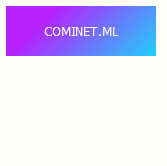
Кнопка с градиентом, которая украсит многий дизайн, ведь по умолчанию в ней прописан красивый эффект при наведении.


HTML

Код
<button class="aslope-detumas">COMINET.ML</button>


CSS

Код
.aslope-detumas {
  -webkit-touch-callout: none;
    -webkit-user-select: none;
     -khtml-user-select: none;
       -moz-user-select: none;
        -ms-user-select: none;
            user-select: none;
  -webkit-tap-highlight-color: transparent;
}

button {
    width: 150px;
    height: 50px;
    cursor: pointer;
    border: none;
    color: white;
    background-color: #1fd1f9;
    background-image: linear-gradient(315deg, #1fd1f9 0%, #b621fe 74%);
    transition: 500ms;
    position: relative;
}

button:before, button:after {
    z-index: -1;
    content: '';
    position: absolute;
    width: 75px;
    height: 0px;
    background: transparent;
    transition: 500ms;
}

button:before {
    transform: translateX(-50px) translateY(27px);
  box-shadow: 5px 5px 16px #ca61ff;
}

button:after {
    transform: translateX(-25px) translateY(27px);
    box-shadow: -5px 5px 16px #1fd1f9;
}

button:hover:before, button:hover:after {
    height: 5px;
}

button:hover {
    box-shadow: inset 0px 5px 10px rgba(255,255,255,0.4);
}

button:focus {
    outline: none;
}


На этом все!

Подписывайтесь! Рекомендуйте нашу группу своим знакомым профессионалам в IT WiN-Prog Наша группа ВКонтакте!


Дата: Вт, 06.07.2021, 18:16 | Сообщение 20
Регистр
04.01.2021
Сообщений
455

Репутация
Кнопка с оригинальной анимацией для сайта или блога.


HTML

Код
<button class="ANULAS-CSAM"></button>


CSS

Код
.ANULAS-CSAM{
  -webkit-touch-callout: none;
    -webkit-user-select: none;
     -khtml-user-select: none;
       -moz-user-select: none;
        -ms-user-select: none;
            user-select: none;
  -webkit-tap-highlight-color: transparent;
}

button {
    width: 150px;
    height: 50px;
    cursor: pointer;
    border: none;
    background-color: #6247aa;
    background-image: linear-gradient(316deg, #6247aa 0%, #a594f9 74%);
    display: flex;
    align-items: center;
    justify-content: center;
}

button:before {
    width: 140px;
    height: 40px;
    content: '';
    background-color: #cdc1ff;
    background-image: linear-gradient(316deg, #cdc1ff 0%, #e5d9f2 74%);
}

button:after {
    content: 'ZorNet.Ru';
    position: absolute;
    color: #6247aa;
}

button:hover:before {
    animation: animate 1s forwards;
}

@keyframes animate {
    33%{width: 150px;
    height: 20px;}
    66%{width: 0px;
    height: 20px;}
    100%{width: 150px;
    height:50px;}
}

button:focus {
    outline: none;
}


Установка завершена!

Подписывайтесь! Рекомендуйте нашу группу своим знакомым профессионалам в IT WiN-Prog Наша группа ВКонтакте!


Дата: Вт, 06.07.2021, 18:19 | Сообщение 21
Регистр
04.01.2021
Сообщений
455

Репутация
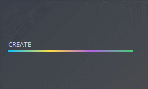
Кнопка, которая идет с растягиванием знаков, где имеет несколько оттенков и красивую анимацию.


HTML

Код
<button class="noselect"></button>


CSS

Код
.noselect {
  -webkit-touch-callout: none;
    -webkit-user-select: none;
     -khtml-user-select: none;
       -moz-user-select: none;
        -ms-user-select: none;
            user-select: none;
  -webkit-tap-highlight-color: transparent;
}

button {
    width: 250px;
    height: 30px;
    cursor: pointer;
    border: none;
    display: flex;
    align-items: center;
    background: transparent;
    background-image: linear-gradient(70deg,#0ebeff,#ffdd40,#ae63e4,#47cf73);
    background-size: 100% 10%;
    background-position: bottom;
    background-repeat: no-repeat;
}

button:before {
    content: 'CREATE';
    color: #ccc;
    transition: 1s;
}

button:hover:before {
    transform: scale(2) translateX(33%);
    letter-spacing: 10px;
    background: -webkit-linear-gradient(70deg,#0ebeff,#ffdd40,#ae63e4,#47cf73);
  -webkit-background-clip: text;
  -webkit-text-fill-color: transparent;
}

button:focus {
    outline: none;
}


На этом все!

Подписывайтесь! Рекомендуйте нашу группу своим знакомым профессионалам в IT WiN-Prog Наша группа ВКонтакте!


Дата: Вт, 06.07.2021, 18:22 | Сообщение 22
Регистр
04.01.2021
Сообщений
455

Репутация
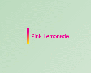
Красиво смотрится кнопка для сайта или для блога, везде отлично смориться.


HTML

Код
<button class="noselect">Pink Lemonade</button>


CSS

Код
* {
  margin: 0;
  padding: 0;
  box-sizing: border-box;
}

body {
  height: 100vh;
  overflow: hidden;
  display: flex;
  align-items: center;
  justify-content: center;
  background-color: #deebdd;
  background-image: linear-gradient(315deg, #deebdd 0%, #bbdbbe 74%);
}

.noselect {
  -webkit-touch-callout: none;
    -webkit-user-select: none;
     -khtml-user-select: none;
       -moz-user-select: none;
        -ms-user-select: none;
            user-select: none;
    -webkit-tap-highlight-color: transparent;
}

button {
  width: 150px;
  height: 50px;
  cursor: pointer;
  font-size: 18px;
  color: #ed008c;
  border: none;
  border-radius: 0px;
  background-color: transparent;
  background-image: linear-gradient(315deg, #fff000 0%, #ed008c 74%);
  background-size: 5% 100%;
  background-repeat: no-repeat;
}

button:hover {
  animation: bg 1s forwards;
}

@keyframes bg {
  50% {
    background-size: 50% 100%;
    background-position: right;
  }
  100% {
    background-size: 100% 100%;
    background-position: right;
    border-radius: 5px;
    color: white;
  }
}

button:focus {
  outline: none;
}


На этом всё!

Подписывайтесь! Рекомендуйте нашу группу своим знакомым профессионалам в IT WiN-Prog Наша группа ВКонтакте!


Дата: Вт, 06.07.2021, 18:24 | Сообщение 23
Регистр
04.01.2021
Сообщений
455

Репутация
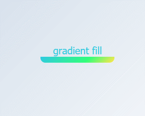
Еще одна кнопка - Градиентная заливка - где безусловно переменяться градиенты.


HTML

Код
<button class="noselect">gradient fill</button>


CSS

Код
* {
  margin: 0;
  padding: 0;
  box-sizing: border-box;
}

body {
  height: 100vh;
  overflow: hidden;
  display: flex;
  align-items: center;
  justify-content: center;
  background-color: #ffffff;
  background-image: linear-gradient(315deg, #ffffff 0%, #d7e1ec 74%);
}

.noselect {
  -webkit-touch-callout: none;
    -webkit-user-select: none;
     -khtml-user-select: none;
       -moz-user-select: none;
        -ms-user-select: none;
            user-select: none;
    -webkit-tap-highlight-color: transparent;
}

button {
  width: 150px;
  height: 50px;
  font-size: 20px;
  color: #2fcbe0;
    text-shadow: 1px 1px 2px rgba(0,0,0,0);
  border: none;
  border-radius: 10px;
  background-color: transparent;
  background-image: linear-gradient(319deg, #fde74c 0%, #32ff7a 37%, #2fcbe0 100%);
  background-size: 100% 25%;
  background-repeat: no-repeat;
  background-position: bottom;
  cursor: pointer;
  transition: 500ms;
}

button:hover {
  color: #eee;
  text-shadow: 1px 1px 2px rgba(0,0,0,0.2);
  background-size: 100% 100%;
}

button:focus {
  outline: none;
}


Установка завершена!

Подписывайтесь! Рекомендуйте нашу группу своим знакомым профессионалам в IT WiN-Prog Наша группа ВКонтакте!


  • Страница 2 из 2
  • «
  • 1
  • 2
Поиск: